Tutorial/Example - Data Analysis using Workstations
Overview
This guide walks through performing exploratory clinical data analysis inside a Quark TRE workstation using JupyterLab. It follows on from Running Cohort Queries from Workstations, which covers how to set up your environment and query approved cohort tables.
The analysis workflow demonstrated here is built around a clinical use case comparing two AFib treatment cohorts — patients receiving Metoprolol only (Cohort A) versus patients receiving Metoprolol + Amiodarone (Cohort B) — using data structured in the OMOP Common Data Model. The workflow covers:
- Cohort Identification and Validation
- Demographic Profiling
- Medical History
- Drug Exposure Comparison
- Length of Stay
- Kaplan-Meier survival analysis
Dataset Note: The code examples in this guide use
mimic_fulldatasetas the cohort name — this references the MIMIC demo dataset used for illustration purposes only. The MIMIC demo dataset contains simulated electronic health records for 100 ICU patients, and any results or visualisations shown here should not be interpreted as clinically valid findings.
Prerequisites
Before beginning this guide, ensure the following:
- You have an approved cohort named
mimic_fulldatasetwhich you can see under the Cohorts tab in your Quark TRE, after you select the Datasets tab in the Navigation panel to the left. - Your JupyterLab notebook is set up as defined under Section 1 (Setup & Installation) in Running Cohort Queries from Workstations.
OMOP Table Reference
The analyses in this guide draw on six OMOP tables. All are queried using run_query() against your approved cohort database.
| Table | Description |
|---|---|
person |
One row per patient; demographics (gender, year of birth, race, ethnicity) |
condition_occurrence |
Clinical conditions recorded per patient visit |
drug_exposure |
Medication administration records |
visit_occurrence |
Hospital and outpatient visit records |
death |
Date and cause of death where recorded |
observation_period |
The time span over which a patient's data is available |
Step 1: Import Libraries
This block installs the visualisation and statistics libraries used throughout the analysis, imports all required modules, and sets the default visual style.
# CODE CHUNK 1
# Installing packages
!pip install lifelines        # Survival analysis (Kaplan-Meier, log-rank test)
!pip install seaborn          # Statistical data visualisation
!pip install matplotlib-venn  # Venn diagram plotting

# Importing libraries
import os
import numpy as np
import pandas as pd
import matplotlib.pyplot as plt
from lifelines import KaplanMeierFitter
import seaborn as sns
from matplotlib_venn import venn2
from scipy.stats import mannwhitneyu
from lifelines.statistics import logrank_test

# Set visual style
sns.set_theme(style="whitegrid")
Step 2: Reading the Required OMOP Tables
This block loads all six OMOP tables into pandas DataFrames in a single pass. It reuses the COHORT_NAME variable and the run_query() function defined in Section 1.
# CODE CHUNK 2
# Reading the clinical tables

QUERY_person = """ SELECT * FROM person """
person = run_query(QUERY_person, database=COHORT_NAME)

QUERY_condition_occ = """ SELECT * FROM condition_occurrence """
condition_occ = run_query(QUERY_condition_occ, database=COHORT_NAME)

QUERY_visit_occ = """ SELECT * FROM visit_occurrence """
visit_occurence = run_query(QUERY_visit_occ, database=COHORT_NAME)

QUERY_drug_exp = """ SELECT * FROM drug_exposure """
drug_exp = run_query(QUERY_drug_exp, database=COHORT_NAME)

QUERY_death = """ SELECT * FROM death """
death = run_query(QUERY_death, database=COHORT_NAME)

QUERY_obs_period = """ SELECT * FROM observation_period """
obs_period = run_query(QUERY_obs_period, database=COHORT_NAME)
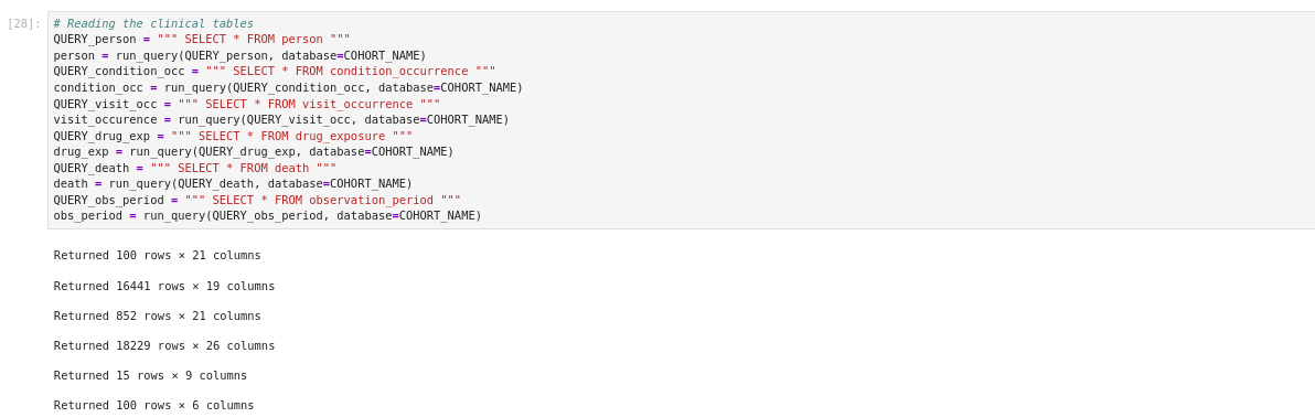
Each call will print the number of rows and columns in the respective table. You can confirm all six tables loaded successfully before continuing by running these commands.
# CODE CHUNK 3
# Confirming tables have loaded

person.head()
condition_occ.head()
visit_occurence.head()
drug_exp.head()
death.head()
obs_period.head()
Step 3: Identifying the Cohorts
This section filters the data to identify patients with atrial fibrillation (AFib) and determines which of those patients received Metoprolol, Amiodarone, or both.
Group A: AFib patients who received Metoprolol
Group B: AFib patients who received Amiodarone
# CODE CHUNK 4
# Find patients with AFib (ECG: atrial fibrillation)
afib_patients = condition_occ[
    condition_occ['condition'] == "ECG: atrial fibrillation"
]['person_id'].unique()

# Define Group A — AFib patients who received Metoprolol
group_a_ids = drug_exp[
    (drug_exp['drug'] == "metoprolol tartrate 25 MG Oral Tablet") &
    (drug_exp['person_id'].isin(afib_patients))
]['person_id'].unique()

# Define Group B — AFib patients who received Amiodarone
group_b_ids = drug_exp[
    (drug_exp['drug'] == "3 ML amiodarone hydrochloride 50 MG/ML Injection") &
    (drug_exp['person_id'].isin(afib_patients))
]['person_id'].unique()

# Visualise the Overlap Between Groups
# Convert to sets for set operations
set_a = set(group_a_ids)
set_b = set(group_b_ids)

# Calculate overlap counts
only_a  = len(set_a - set_b)          # Metoprolol only
only_b  = len(set_b - set_a)          # Amiodarone only
overlap = len(set_a & set_b)           # Both drugs

# Plot Venn diagram
plt.figure()
v = venn2(
    subsets=(only_a, only_b, overlap),
    alpha=0.7,
    set_labels=('AFib + Metoprolol', 'AFib + Amiodarone')
)

# Set region colours
v.get_patch_by_id('10').set_color('#1f77b4')  # Metoprolol only
v.get_patch_by_id('01').set_color('#FF7F7F')  # Amiodarone only
v.get_patch_by_id('11').set_color('#9C6ADE')  # Both

plt.title("Overlap of Patients Receiving Metoprolol and Amiodarone in AFib")

# Save and display
plt.savefig("/output/Overlap_of_Afib_Treatment_groups.png", dpi=300)
plt.show()
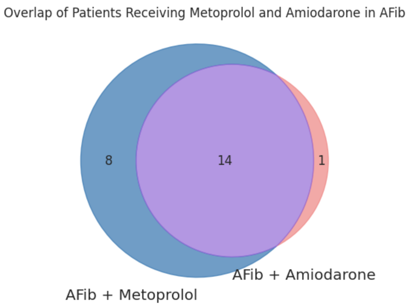
Key Insights
- Most patients receiving Amiodarone are also on Metoprolol.
Quite a few patients are administered Amiodarone only.
Since there is a major overlap, we will proceed the cohortA with Afib condition who have been administered Metoprolol only and cohort B with Afib condition who have been administered Metoprolol and Amiodarone both.
Step 4: Cohort Validation
This section defines the two final analysis cohorts and validates that they are mutually exclusive (no patient appears in both).
- Cohort A: AFib + Metoprolol only (patients who received Metoprolol but not Amiodarone)
- Cohort B: AFib + Metoprolol + Amiodarone (patients who received both drugs)
# CODE CHUNK 5
# Cohort A: patients who received Metoprolol but NOT Amiodarone
cohort_a_ids = set(group_a_ids) - set(group_b_ids)

# Cohort B: patients who received both Metoprolol AND Amiodarone
cohort_b_ids = set(group_a_ids).intersection(set(group_b_ids))

# Validate: plot Venn diagram to confirm no overlap between final cohorts
set_metoprolol = set(cohort_a_ids)
set_amiodarone = set(cohort_b_ids)

plt.figure()
venn2(
    [set_metoprolol, set_amiodarone],
    set_colors=('#1f77b4', '#d62728'),
    set_labels=('Cohort A: Metoprolol', 'Cohort B: Metoprolol + Amiodarone')
)
plt.title("Venn Diagram: Check overlap between Cohort A and Cohort B")

# Save and display
plt.savefig("/output/Patient_Overlap_for_two_cohorts.png", dpi=300)
plt.show()

# Print cohort sizes
print("Metoprolol only:", len(set_metoprolol - set_amiodarone))
print("Amiodarone only:", len(set_amiodarone - set_metoprolol))
print("Both drugs:", len(set_metoprolol.intersection(set_amiodarone)))
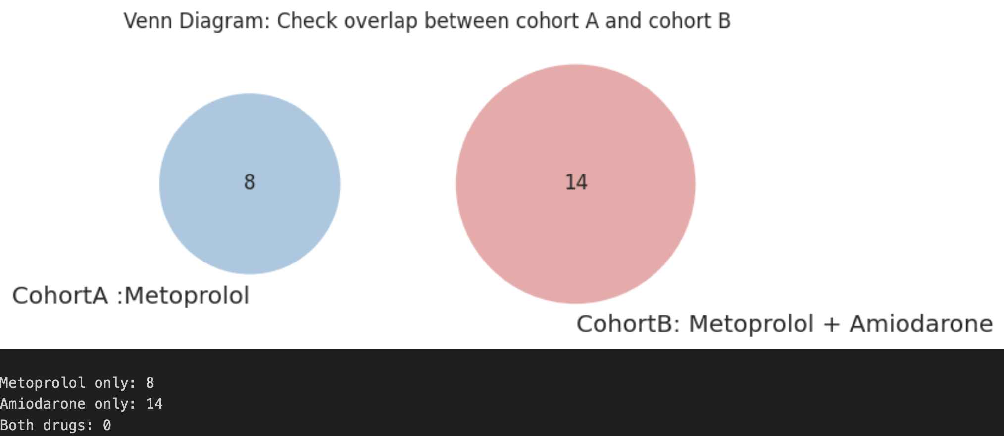
Key Insights
- No patient overlap was observed between the two cohorts.
- This confirms that we are dealing with distinct and non-overlapping patients in these two cohorts.
Step 5: Cohort Profiling
This section characterises and compares the demographic profiles of Cohort A and Cohort B across two dimensions: gender and ethnicity.
Run this code chunk to create labelled data frames for each cohort and concatenate them into a single combined_df used for the downstream analysis steps.
# CODE CHUNK 6
# Create labelled cohort DataFrames
cohort_a = person[person['person_id'].isin(cohort_a_ids)].copy()
cohort_b = person[person['person_id'].isin(cohort_b_ids)].copy()

cohort_a['Cohort'] = 'Metoprolol only'
cohort_b['Cohort'] = 'Metoprolol + Amiodarone'

# Combine into a single DataFrame
combined_df = pd.concat([cohort_a, cohort_b], ignore_index=True)

combined_df.head(2)
#----CHECKPOINT 1----#

Gender Distribution
# CODE CHUNK 7
# Count patients by gender and cohort
gender_counts = combined_df.groupby(
    ['Cohort', 'gender'], observed=True
).size().reset_index(name='Count')

# Define cohort display order and colour palette
cohort_order = ["Metoprolol only", "Metoprolol + Amiodarone"]

combined_df["Cohort"] = pd.Categorical(
    combined_df["Cohort"], categories=cohort_order, ordered=True
)

cohort_palette = {
    "Metoprolol only": "#1f77b4",         # blue
    "Metoprolol + Amiodarone": "#d62728"  # red
}

# Calculate percentage within each cohort
gender_counts["Percent"] = (
    gender_counts.groupby("Cohort", observed=True)["Count"]
    .transform(lambda x: x / x.sum() * 100)
)

sns.set_style("whitegrid")

# Create side-by-side plots (counts and percentages)
fig, axes = plt.subplots(1, 2, figsize=(14, 4))

# Plot 1: Gender Counts
ax1 = sns.barplot(
    data=gender_counts, x="gender", y="Count",
    hue="Cohort", hue_order=cohort_order, palette=cohort_palette, ax=axes[0]
)
ax1.set_title("Gender Distribution by Cohort (Counts)")
ax1.set_xlabel("Gender")
ax1.set_ylabel("Number of Patients")
for container in ax1.containers:
    ax1.bar_label(container, padding=3, fontsize=10, fontweight="bold")

# Plot 2: Gender Percentage
ax2 = sns.barplot(
    data=gender_counts, x="gender", y="Percent",
    hue="Cohort", hue_order=cohort_order, palette=cohort_palette, ax=axes[1]
)
ax2.set_title("Gender Distribution by Cohort (%)")
ax2.set_xlabel("Gender")
ax2.set_ylabel("Percentage")
for container in ax2.containers:
    ax2.bar_label(container, fmt="%.1f%%", padding=3, fontsize=10, fontweight="bold")

# Shared legend
ax1.legend_.remove()
ax2.legend_.remove()
handles, labels = ax1.get_legend_handles_labels()
fig.legend(handles, labels, title="Cohort", loc="center left", bbox_to_anchor=(1.02, 0.5))

plt.tight_layout()
plt.savefig("/output/Cohort_Profiling_Gender.png", dpi=300)
plt.show()
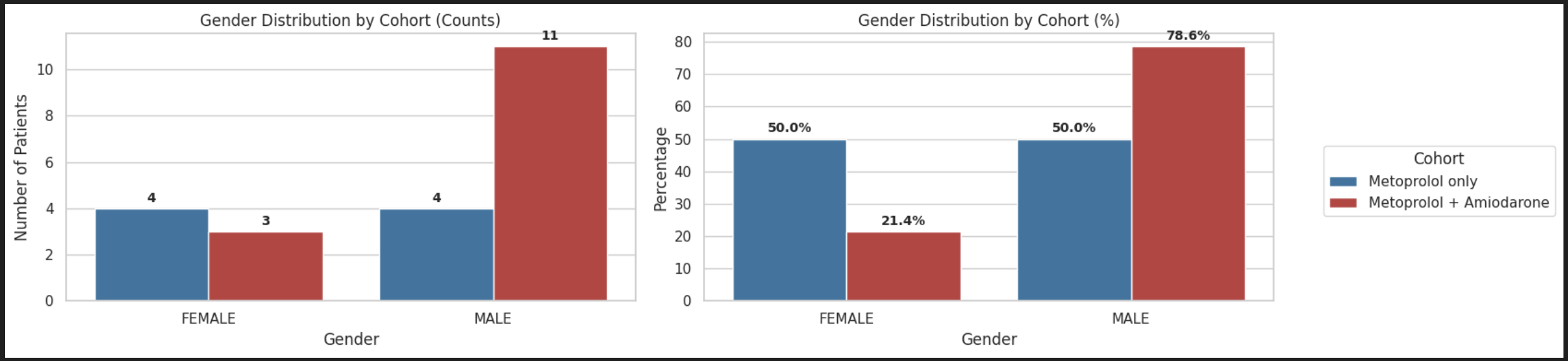
Key Insights
- Here, the metoprolol + amiodarone cohort shows a higher proportion of males (78.6%) compared to the metoprolol-only cohort (50%).
- In contrast, females represent a smaller proportion in the escalation group (21.4% vs 50%).
Ethnicity Distribution
# CODE CHUNK 8
# Count patients by ethnicity and cohort
ethnicity_counts = combined_df.groupby(
    ['Cohort', 'ethnicity'], observed=True
).size().reset_index(name='Count')

# Calculate percentage within each cohort
ethnicity_counts["Percent"] = (
    ethnicity_counts.groupby("Cohort", observed=True)["Count"]
    .transform(lambda x: x / x.sum() * 100)
)

fig, axes = plt.subplots(1, 2, figsize=(14, 4))

# Plot 1: Ethnicity Counts
ax1 = sns.barplot(
    data=ethnicity_counts, x="ethnicity", y="Count",
    hue="Cohort", hue_order=cohort_order, palette=cohort_palette, ax=axes[0]
)
ax1.set_title("Ethnicity Distribution by Cohort (Counts)")
ax1.set_xlabel("Ethnicity")
ax1.set_ylabel("Number of Patients")
for container in ax1.containers:
    ax1.bar_label(container, padding=3, fontsize=10, fontweight="bold")

# Plot 2: Ethnicity Percentage
ax2 = sns.barplot(
    data=ethnicity_counts, x="ethnicity", y="Percent",
    hue="Cohort", hue_order=cohort_order, palette=cohort_palette, ax=axes[1]
)
ax2.set_title("Ethnicity Distribution by Cohort (%)")
ax2.set_xlabel("Ethnicity")
ax2.set_ylabel("Percentage")
for container in ax2.containers:
    ax2.bar_label(container, fmt="%.1f%%", padding=3, fontsize=10, fontweight="bold")

# Shared legend
ax1.legend_.remove()
ax2.legend_.remove()
handles, labels = ax1.get_legend_handles_labels()
fig.legend(handles, labels, title="Cohort", loc="center left", bbox_to_anchor=(1.02, 0.5))

plt.tight_layout()
plt.savefig("/output/Cohort_Profiling_Ethnicity.png", dpi=300)
plt.show()
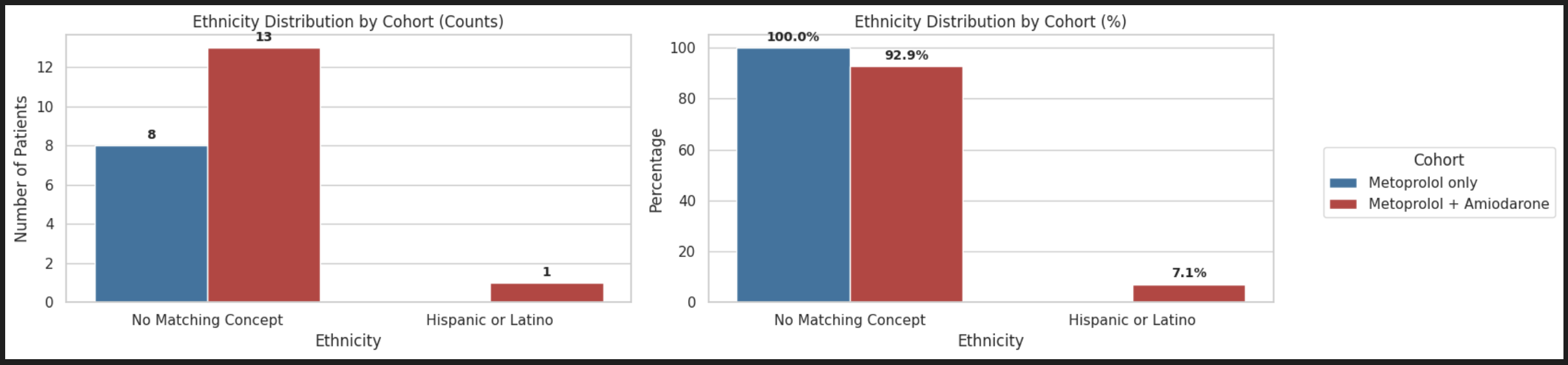
Key Insights
- A large proportion of ethnicity entries are labeled “No Matching Concept”, indicating that many records could not be mapped to a standardized vocabulary concept, which limits reliable interpretation of ethnicity distribution across cohorts.
- Ethnicity data seems to be poorly captured in this dataset.
Step 6: Medical History
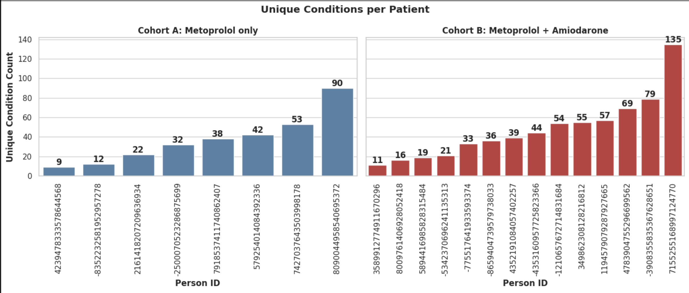
This section compares the number of unique conditions recorded for each patient between the two cohorts.
# CODE CHUNK 9
# Subset condition_occurrence to cohort patients only
cohort_person_ids = combined_df["person_id"].unique()

condition_subset = condition_occ[
    condition_occ["person_id"].isin(cohort_person_ids)
]

# Count unique conditions per patient
conditions_per_patient = (
    condition_subset
    .groupby("person_id")["condition"]
    .nunique()
    .reset_index(name="Unique_Condition_Count")
)

# Attach cohort label
conditions_per_patient = conditions_per_patient.merge(
    combined_df[["person_id", "Cohort"]],
    on="person_id",
    how="left"
)

# Sort by condition count within each cohort
conditions_per_patient_sorted = (
    conditions_per_patient
    .sort_values(["Cohort", "Unique_Condition_Count"])
)

# Plot unique conditions per patient, separated by cohort
fig, axes = plt.subplots(1, 2, figsize=(14, 6), sharey=True)

# Cohort A
cohort_a_data = conditions_per_patient_sorted[
    conditions_per_patient_sorted["Cohort"] == "Metoprolol only"
]
sns.barplot(
    data=cohort_a_data, x="person_id", y="Unique_Condition_Count",
    ax=axes[0], color="steelblue", order=cohort_a_data["person_id"]
)
axes[0].set_title("Cohort A: Metoprolol only", fontweight="bold")
axes[0].set_xlabel("Person ID", fontweight="bold")
axes[0].set_ylabel("Unique Condition Count", fontweight="bold")
axes[0].tick_params(axis='x', rotation=90)
for container in axes[0].containers:
    axes[0].bar_label(container, fontweight="bold")

# Cohort B
cohort_b_data = conditions_per_patient_sorted[
    conditions_per_patient_sorted["Cohort"] == "Metoprolol + Amiodarone"
]
sns.barplot(
    data=cohort_b_data, x="person_id", y="Unique_Condition_Count",
    ax=axes[1], color="#d62728", order=cohort_b_data["person_id"]
)
axes[1].set_title("Cohort B: Metoprolol + Amiodarone", fontweight="bold")
axes[1].set_xlabel("Person ID", fontweight="bold")
axes[1].tick_params(axis='x', rotation=90)
for container in axes[1].containers:
    axes[1].bar_label(container, fontweight="bold")

plt.suptitle("Unique Conditions per Patient", fontweight="bold")
plt.tight_layout()
plt.savefig("/output/Unique_conditions.png")
plt.show()
OUTPUT:
Key Insights
- Higher comorbidity burden in the combination therapy cohort: Patients receiving both Metoprolol and Amiodarone exhibit a noticeably higher number of unique conditions compared to those receiving Metoprolol alone, indicating that combination therapy maybe more frequently prescribed in patients with greater overall disease burden.
- Greater variability in the combination therapy cohort: Wider spread in condition counts is seen in Amiodarone cohort ranging from 11 to 135 as compared to only Metoprolol one (9 to 90).
Step 7: Drug Exposure
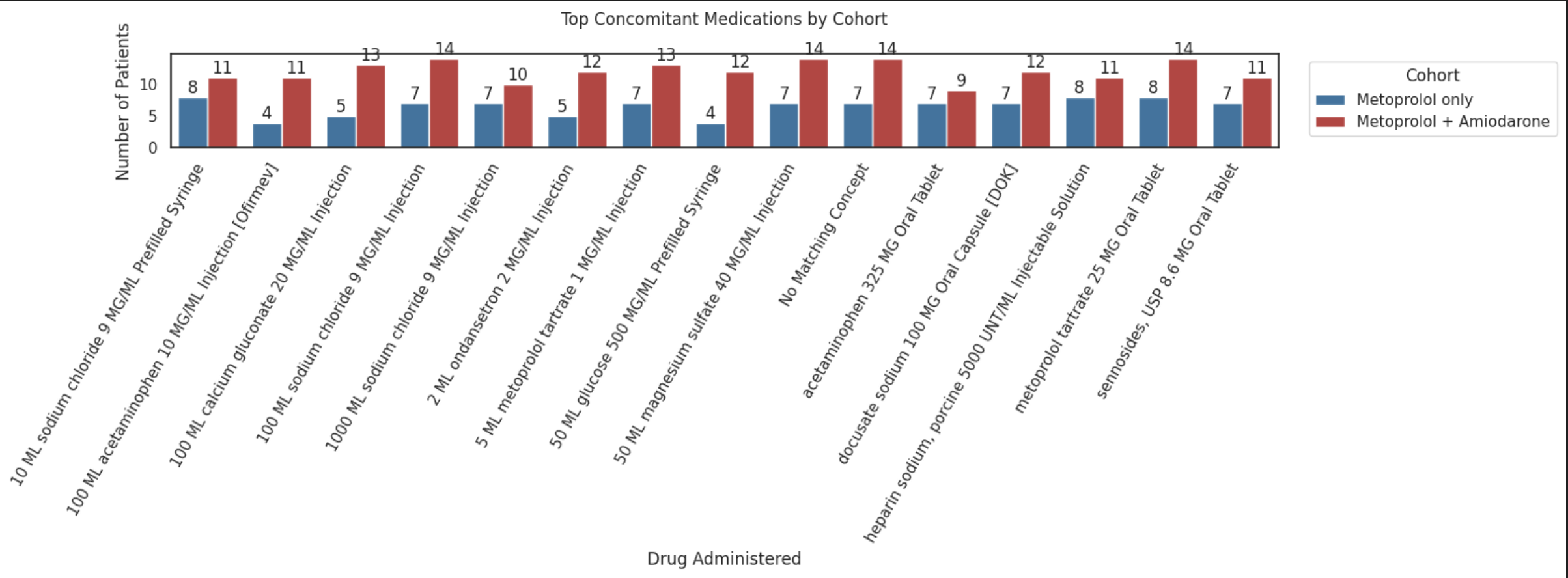
In this section, the most frequently administered drugs were identified and compared between cohorts showing the patient counts for each drug.
# CODE CHUNK 10
# Combine patient IDs from both cohorts
cohort_ids = pd.concat([cohort_a["person_id"], cohort_b["person_id"]]).unique()

# Filter drug_exposure to cohort patients
drug_subset = drug_exp[drug_exp["person_id"].isin(cohort_ids)]

# Attach cohort label
drug_subset = drug_subset.merge(
    combined_df[["person_id", "Cohort"]],
    on="person_id",
    how="left"
)

# Count unique patients receiving each drug, per cohort
drug_counts = (
    drug_subset
    .groupby(["drug", "Cohort"], observed=True)["person_id"]
    .nunique()
    .reset_index(name="Patient_Count")
)

# Identify top 15 drugs by total patient count across both cohorts
top_drugs = (
    drug_counts
    .groupby("drug")["Patient_Count"]
    .sum()
    .sort_values(ascending=False)
    .head(15)
    .index
)

drug_plot = drug_counts[drug_counts["drug"].isin(top_drugs)]

# Plot top concomitant medications by cohort
plt.figure(figsize=(16, 6))

ax = sns.barplot(
    data=drug_plot,
    x="drug", y="Patient_Count",
    hue="Cohort",
    palette={"Metoprolol only": "#1f77b4", "Metoprolol + Amiodarone": "#d62728"}
)

plt.xticks(rotation=60, ha="right")
plt.xlabel("Drug Administered")
plt.ylabel("Number of Patients")
plt.title("Top Concomitant Medications by Cohort\n")

for container in ax.containers:
    ax.bar_label(container)

ax.legend(title="Cohort", bbox_to_anchor=(1.02, 1), loc="upper left")
plt.tight_layout()
plt.savefig("/output/Drug_Exposure.png")
plt.show()
OUTPUT:
Key Insights
- Similar supportive treatment patterns across cohorts : Most commonly administered medications, such as intravenous fluids (sodium chloride), analgesics (acetaminophen), anticoagulants (heparin), and gastrointestinal support medications appear in both cohorts, indicating that patients in both groups received broadly similar supportive inpatient care.
- Frequent electrolyte management among AFib patients : Medications such as magnesium sulfate and calcium gluconate appear frequently in both cohorts, suggesting that electrolyte correction is a common component of clinical management in these AFib patients, which aligns with standard care for arrhythmia stabilization
Step 8: Length of Stay (LOS)
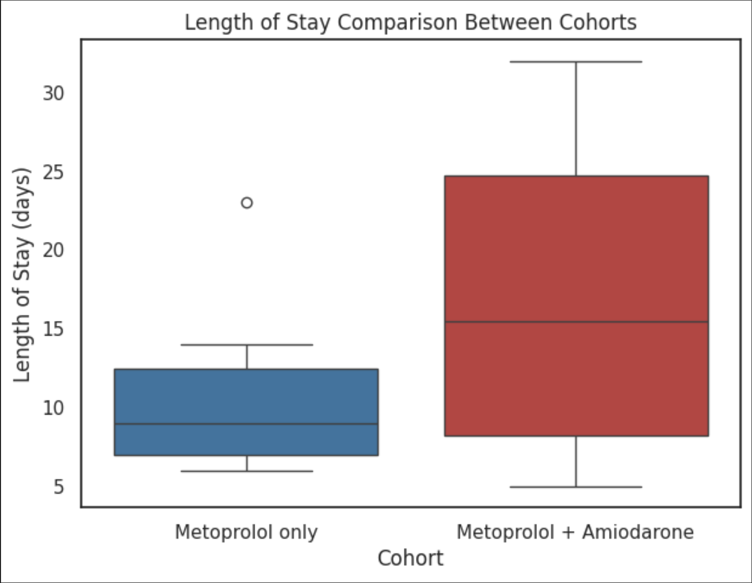
This section calculates the maximum inpatient length of stay per patient (in days) and compares distributions between cohorts using a boxplot.
# CODE CHUNK 11
# Filter visit_occurrence to cohort patients
cohort_ids = pd.concat([cohort_a["person_id"], cohort_b["person_id"]]).unique()

visits = visit_occurence[visit_occurence["person_id"].isin(cohort_ids)]

# Attach cohort label
visits = visits.merge(
    combined_df[["person_id", "Cohort"]],
    on="person_id",
    how="left"
)

# Calculate LOS in days for each visit
visits["LOS_days"] = (
    pd.to_datetime(visits["visit_end_date"]) -
    pd.to_datetime(visits["visit_start_date"])
).dt.days

# Take the maximum LOS per patient (to capture the longest admission)
los_patient = (
    visits
    .groupby(["person_id", "Cohort"], observed=True)["LOS_days"]
    .max()
    .reset_index()
)

# Boxplot comparing LOS between cohorts
plt.figure(figsize=(7, 5))
sns.boxplot(
    data=los_patient,
    x="Cohort", y="LOS_days",
    hue="Cohort",
    palette={"Metoprolol only": "#1f77b4", "Metoprolol + Amiodarone": "#d62728"}
)
plt.ylabel("Length of Stay (days)")
plt.title("Length of Stay Comparison Between Cohorts")
plt.savefig("/output/Length_of_Stay.png", dpi=300)
plt.show()
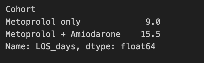
Median LOS per cohort:
# CODE CHUNK 12
los_patient.groupby("Cohort", observed=True)["LOS_days"].median()
Key Insights
- Patients receiving combination therapy have noticeably higher LOS (~median 15 days) as compared to the ones only on Metoprolol (~median 9 days) suggesting more severe cases demanding longer stay in the hospitals.
- Also, suggests more hospital resource utilization
Step 9: Kaplan-Meier Survival Analysis
Kaplan–Meier survival analysis was performed to estimate the probability of survival over time following treatment initiation. Survival curves were generated to compare time-to-death between the Metoprolol only and Metoprolol + Amiodarone cohorts.
Key Considerations for Kaplan–Meier Survival Analysis
- Define Time Zero (Start of Follow-up): Each patient must have a clear starting point for observation. In this analysis, follow-up begins at the first drug exposure.
- Define the Event of Interest: The event represents the outcome being studied. Here, the event is death.
- Handle Censoring: If a patient does not experience the event during the observation period, their survival time is censored at the last known observation date.
- Calculate Survival Duration: Survival time is measured as the time from drug exposure to either death or censoring.
- Compare Survival Between Groups: Kaplan–Meier curves estimate the probability of survival over time for each treatment cohort and allow visual comparison between groups.
# CODE CHUNK 13
# Anchor time 0 to each patient's first drug exposure date
drug_start = (
    drug_subset
    .sort_values("drug_exposure_start_date")
    .groupby("person_id")
    .first()
    .reset_index()[["person_id", "drug_exposure_start_date"]]
)

# Merge death dates
survival_df = drug_start.merge(
    death[["person_id", "death_date"]],
    on="person_id", how="left"
)

# Attach cohort labels
survival_df = survival_df.merge(
    combined_df[["person_id", "Cohort"]],
    on="person_id", how="left"
)

# Parse dates
survival_df["drug_exposure_start_date"] = pd.to_datetime(
    survival_df["drug_exposure_start_date"]
)
survival_df["death_date"] = pd.to_datetime(survival_df["death_date"])

# Event indicator: 1 = death recorded, 0 = censored
survival_df["event"] = survival_df["death_date"].notna().astype(int)

# For censored patients, use observation period end date as the end date
survival_df = survival_df.merge(
    obs_period[["person_id", "observation_period_end_date"]],
    on="person_id", how="left"
)

survival_df["end_date"] = survival_df["death_date"].fillna(
    survival_df["observation_period_end_date"]
)

# Calculate follow-up duration in days
survival_df["time_days"] = (
    survival_df["end_date"] - survival_df["drug_exposure_start_date"]
).dt.days

# Fit and plot KM curves for each cohort
kmf = KaplanMeierFitter()

plt.figure(figsize=(7, 5))

colors = {
    "Metoprolol only": "#1f77b4",
    "Metoprolol + Amiodarone": "#d62728"
}

for cohort, df in survival_df.groupby("Cohort", observed=True):
    kmf.fit(
        durations=df["time_days"],
        event_observed=df["event"],
        label=cohort
    )
    kmf.plot_survival_function(
        ci_show=False, color=colors[cohort], linewidth=2
    )

plt.title("Kaplan-Meier Survival Curve by Treatment Cohort")
plt.xlabel("Days since drug exposure")
plt.ylabel("Survival probability")
plt.legend(title="Cohort")
plt.grid(alpha=0.3)
plt.savefig("/output/KM_Survival_Plot.png", dpi=300)
plt.show()
OUTPUT:
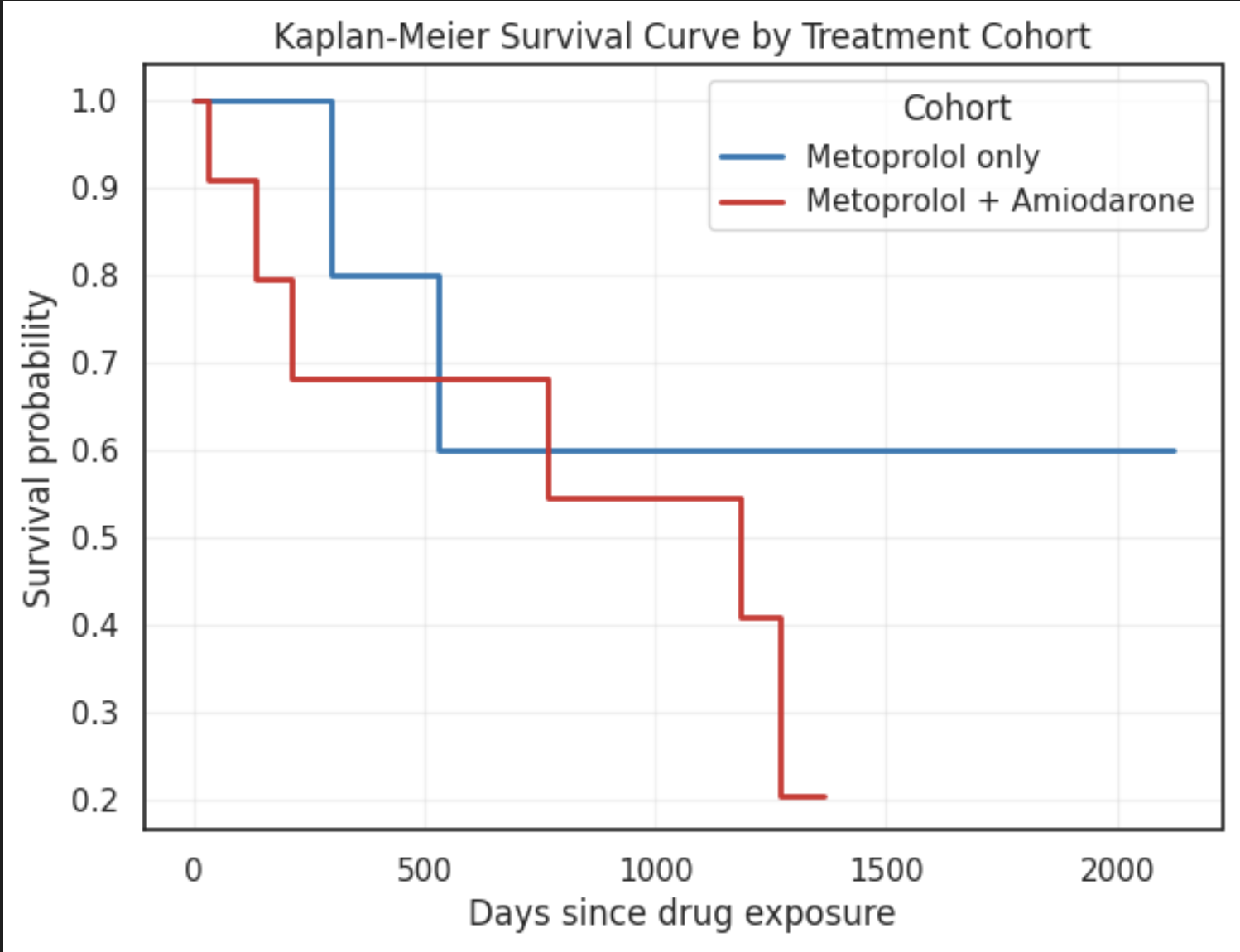
Key Insights
- Metoprolol-only cohort shows better long-term survival maintaining a higher survival probability over time
- The Metoprolol + Amiodarone cohort experiences a faster decline in survival suggesting poorer survival outcomes or higher baseline disease severity in this group
Disclaimer
- The dataset used in this notebook is simulated and intended only for demonstration purposes.
- The analysis workflow reflects typical approaches used with the OMOP Common Data Model and the insights do not represent real clinical outcomes.
- Any findings, visualizations, or statistical results shown here should not be interpreted as medically valid or used for clinical decision-making.
What's Next
- Download your plots and results — See Downloading Data Results for the file download workflow from the Results tab.
- Manage workstation resources — See Manage Resources.