User Activity
Overview
The User Activity section gives the Admin a platform-wide view of how users are engaging with Quark V3 — tracking onboarding trends over time and breaking down active usage by user, team, and project. It is the primary tool for identifying highly active or dormant users, and producing activity data for compliance or operational reviews.
Navigation: Select User Activity from the left-hand navigation pane.
The User Activity Dashboard
The dashboard is divided into two main areas: the filter panel on the left, and the activity charts and table on the right. All charts and the summary table update in response to the filters you apply.
Use the download icon in the top-right corner to export the current view as a CSV file. The export reflects whatever filters are active at the time.
Filtering the View
The left-hand filter panel lets you scope the dashboard to a specific part of your organisation. Filters cascade — selecting a Team narrows the available options in Team2, and so on.
| Filter | Description |
|---|---|
| Team | Filter to a specific top-level team. Defaults to All. |
| Team2 | Filter to a second-level team within the selected Team. Options update based on the Team selection. |
| Team3 | Filter to a third-level team within the selected Team2. |
| Project | Filter to a specific project. |
| Users | Filter to a specific individual user. |
| Date Range | Restrict the view to a custom date window — useful for periodic reporting or investigating activity during a specific period. |
| Resources | Filter by resource type to focus the activity view on a specific category (e.g., Users, Workstations, Pipelines). |
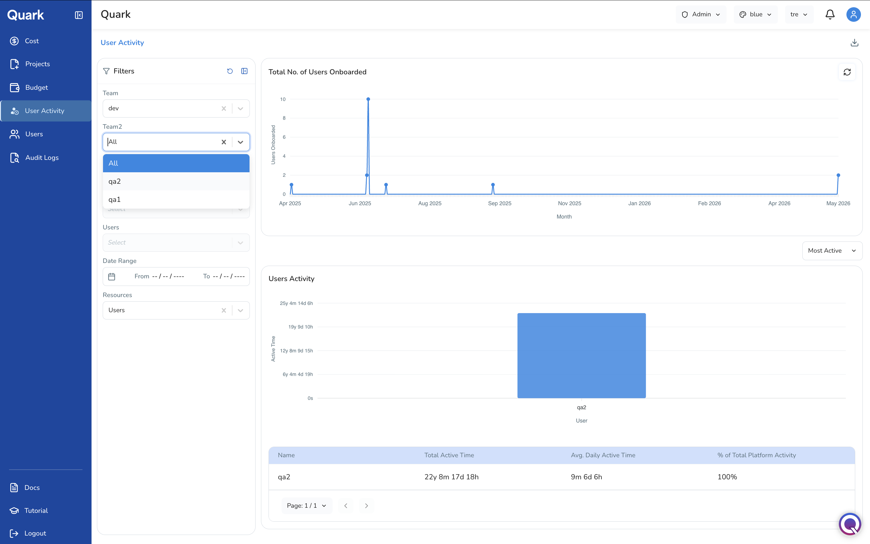
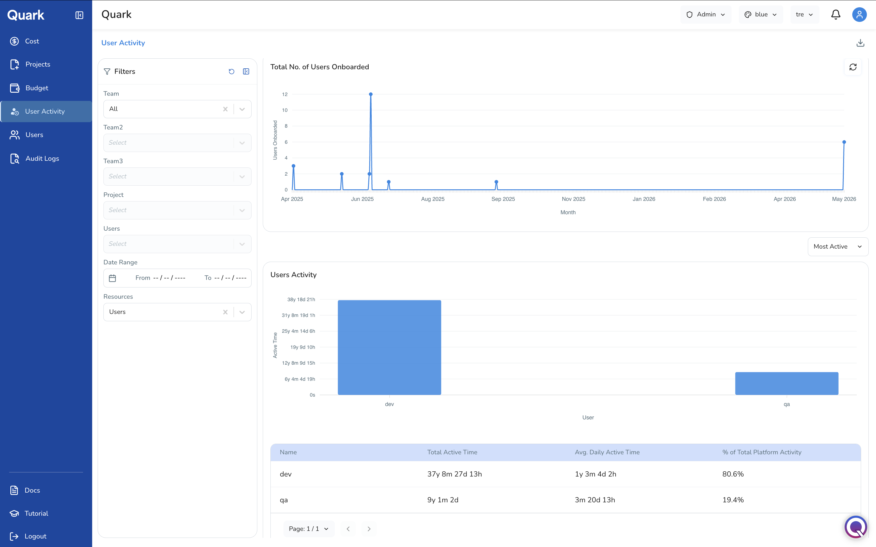
Total No. of Users Onboarded
The line chart at the top of the dashboard tracks how many users were onboarded to the platform each month over the selected date range. Each point on the line represents the number of new users added in that month.
You can use this chart to confirm that a recent batch of user invitations has registered on the platform.
Use the refresh icon in the top-right corner of the chart to reload the data.
Users Activity
The lower portion of the dashboard focuses on how actively users are using the platform within the filtered scope.
Sort Control
Use the Most Active dropdown above the chart to change the sort order of users displayed. Sorting by most active surfaces the users consuming the most platform time; useful for correlating activity with resource costs.
Activity Bar Chart
The bar chart plots each user on the X-axis against their cumulative Active Time on the Y-axis. Active time is expressed in years, months, days, and hours (e.g., 37y 8m 27d 13h). The chart updates to reflect the current filter selection — narrowing to a specific team or project will show only the users within that scope.
Activity Summary Table
Below the bar chart, the summary table provides a per-user breakdown:
| Column | Description |
|---|---|
| Name | The user's name or identifier. |
| Total Active Time | The cumulative time this user has been active on the platform within the filtered period. |
| Avg. Daily Active Time | The user's average active time per day, providing a normalised view of engagement independent of how long they have been on the platform. |
| % of Total Platform Activity | This user's share of all active time across the platform (or the filtered scope), expressed as a percentage. |
What's Next
- Cost — Cross-reference high-activity users with their resource spend to understand whether usage is translating into expected costs.
- Audit Logs — For a granular, action-level record of what a specific user did, filter the audit log by that user.
- Users — If activity data reveals dormant accounts, review and deactivate them from the Users section.